KATIE MORRIS | CREATIVE DIRECTION

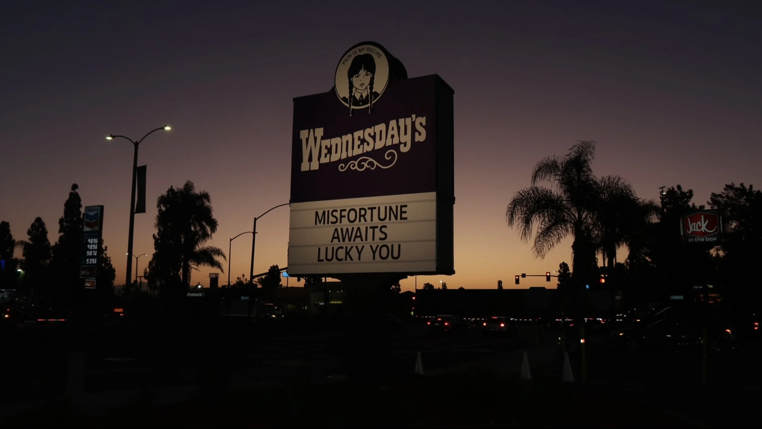
"Misfortune Awaits — Lucky You."
THE ASK
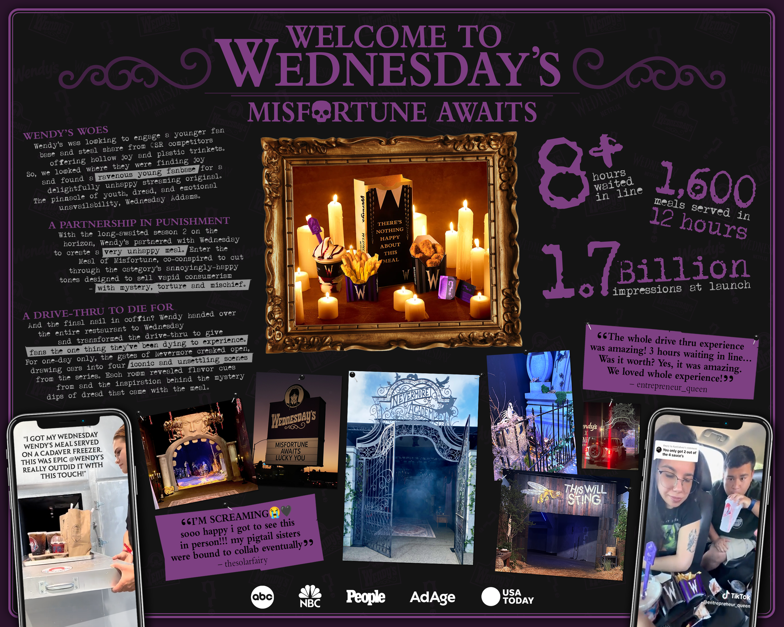
Wendy's scored a partnership with Netflix's Wednesday and needed an activation worthy of Nevermore Academy itself. The mission: transform a real drive-thru into an immersive fan experience that introduced the limited-time Meal of Misfortune (Raven's Blood Frosty served with a Spoon of Gloom, obviously), Rest in 10-Piece Nuggets, Cursed & Crispy Fries, and four mystery dipping sauces — while making enough cultural noise to matter beyond the menu.
MY ROLE
I served as one of the acting Creative Directors on the project, bringing conceptual thinking, art direction, deep-cut fan knowledge, and — full disclosure — an embarrassing number of rewatches of the show for research purposes. I was responsible for selling in the idea with both clients, producing final art, attending the physical build to guide propping decisions, and walking both the Wendy's and Netflix clients through the completed experience. From first sketch to final morgue door, this one had my fingerprints all over it.
(Yes, I've been an Addams Family fan since I was a little girl. Yes, this was a dream project. Yes, I am still not over it.)
THE SOLUTION
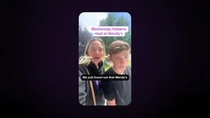
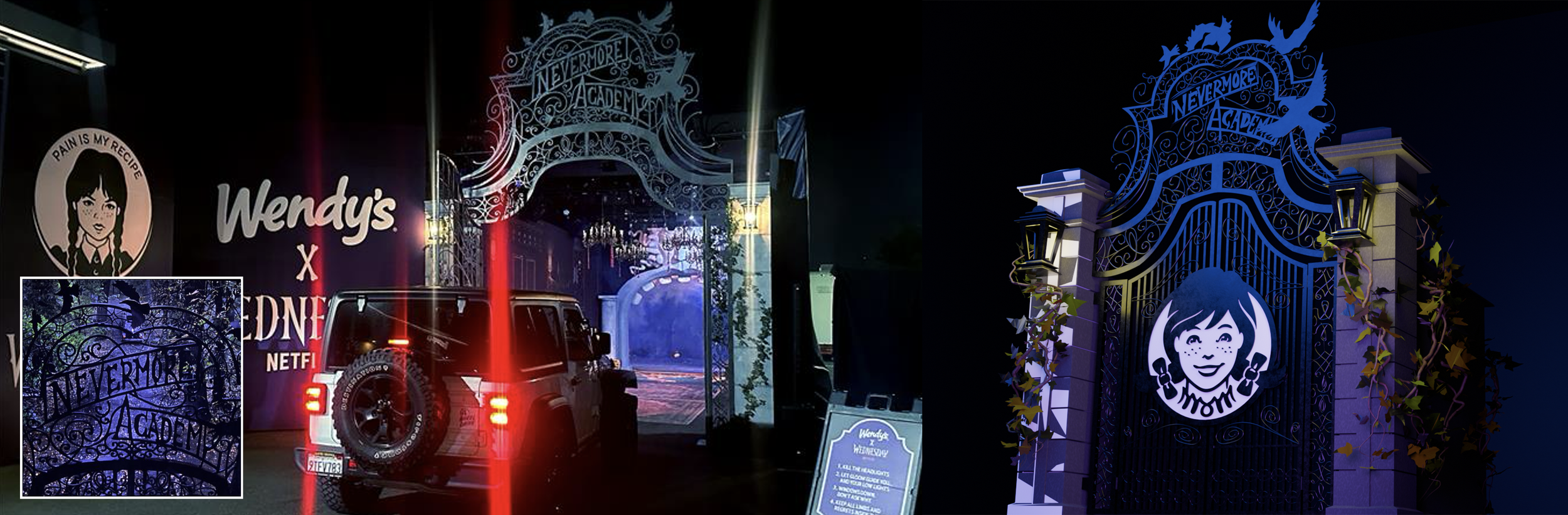
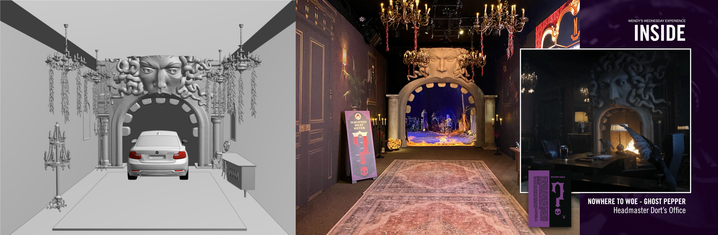
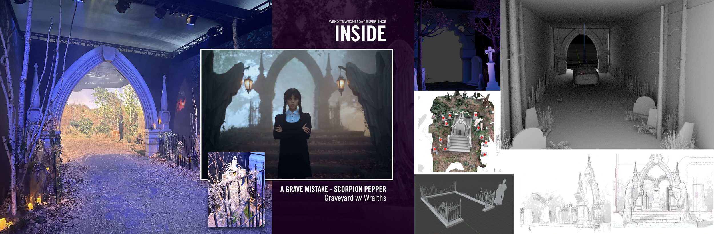
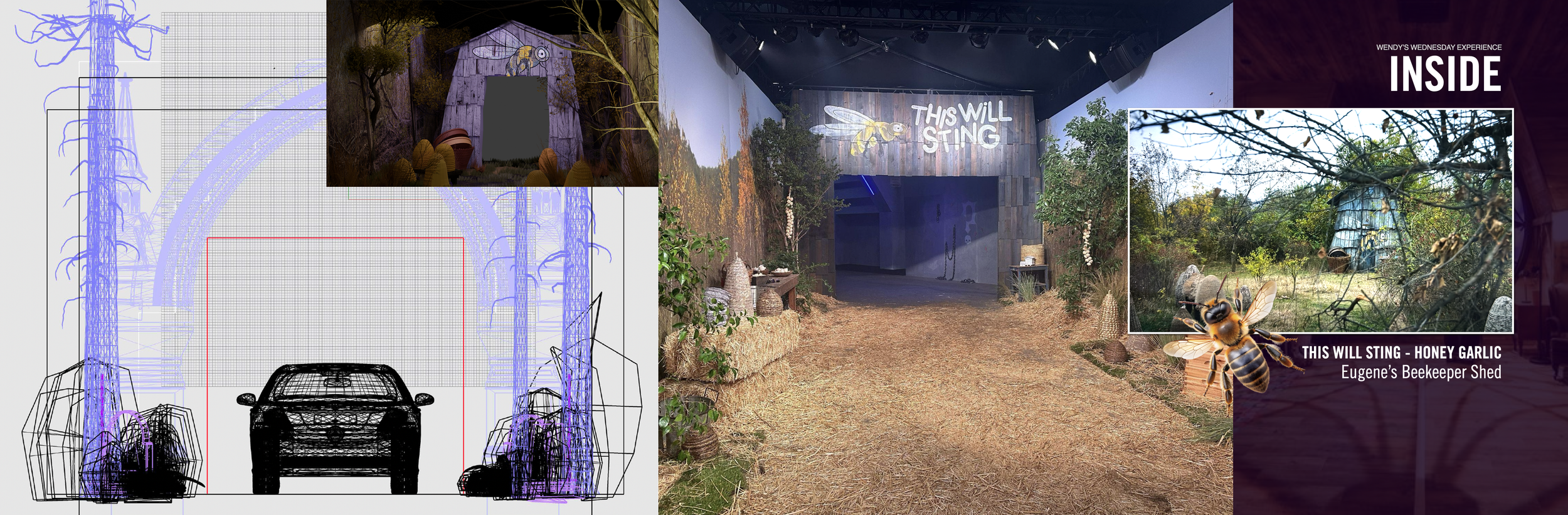
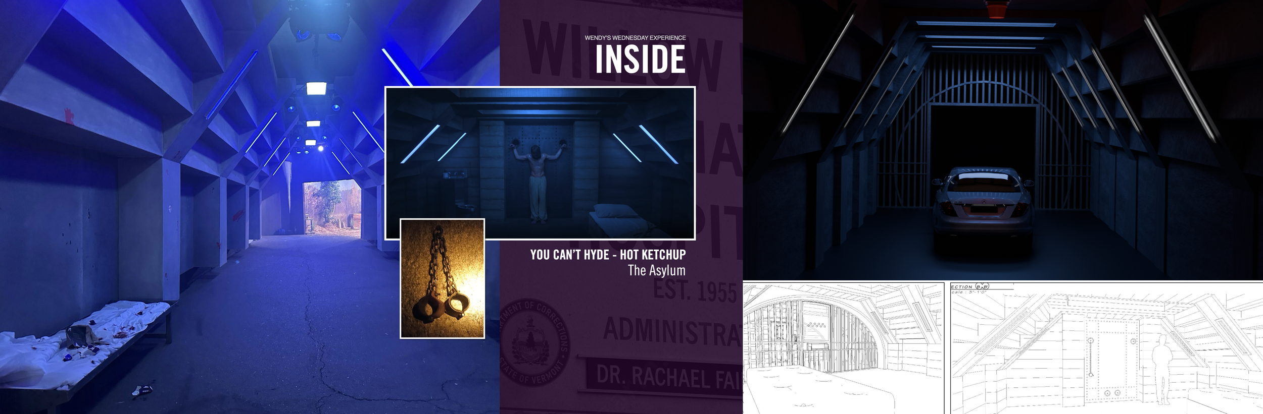
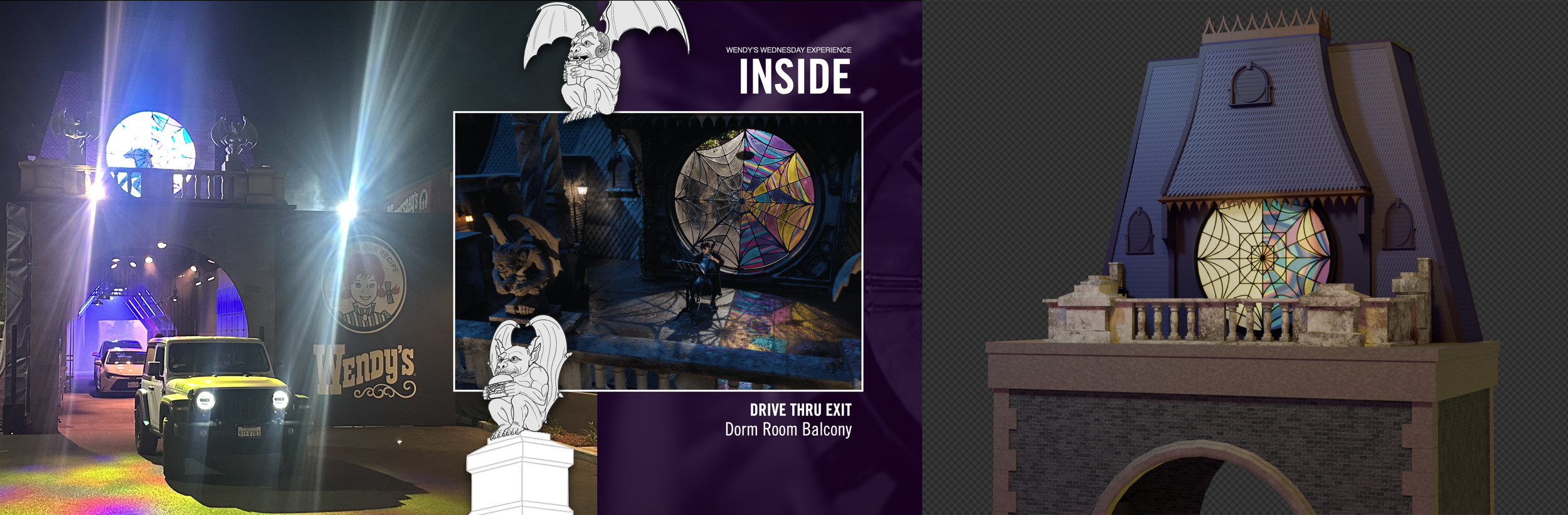
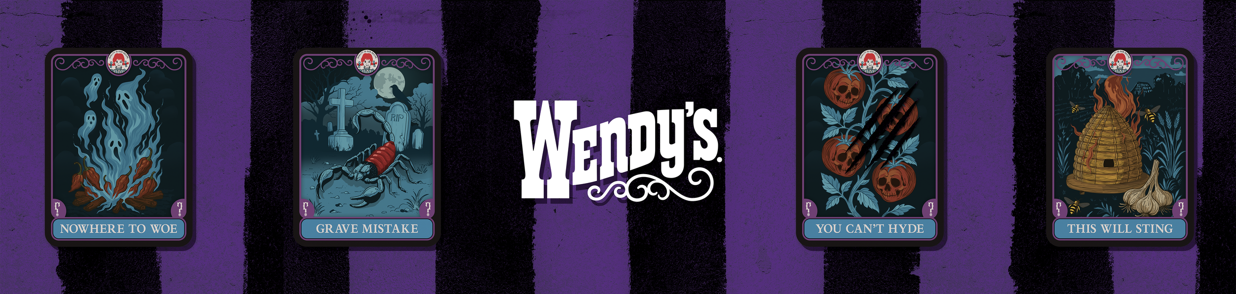
We turned a Los Angeles Wendy's into the first-ever guest visit to Nevermore Academy. As guests drove through, each themed zone introduced one of the four mystery sauces through show-inspired environments: the "Nowhere to Woe" Ghost Pepper section, "A Grave Mistake" (Scorpion Pepper), "This Will Sting" (Honey Garlic, complete with a beehive woodland scene), and "You Can't Hyde" Hot Ketchup, each one a little more unhinged than the last.
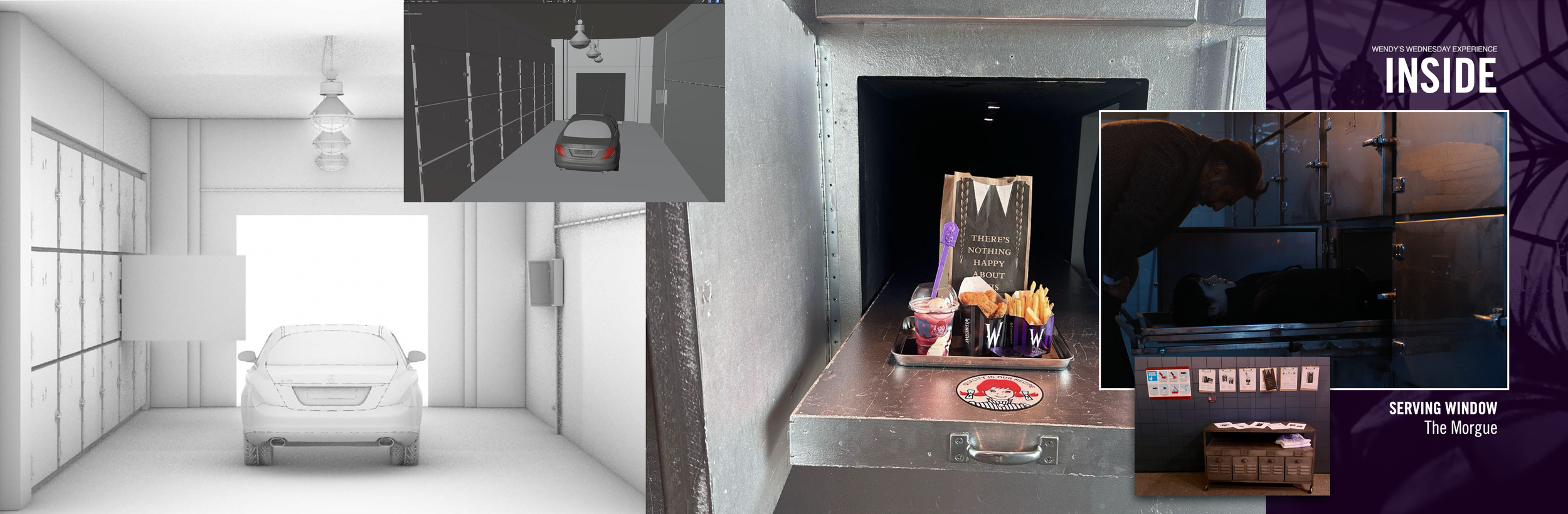
The grand finale? Guests received their Meal of Misfortune through a morgue cooler door, a stainless steel sliding tray straight out of the Nevermore morgue set. That detail was my idea, born from a weekend rewatch session and a phone call that started with "is it too much or stupid to do..." It was not. The morgue window became the most talked-about and shared moment of the entire experience.
THE RESULT
Massive organic TikTok reach, a wave of fan-filmed content that basically marketed itself, and a CLIO Award to make it official. Both clients left happy. Fans left with purple sauce on their fingers and a story worth telling.
Agency: TMA | ECD: Laragh Gallagher | CD (Art Direction): Katie Morris / Charles McBride | CD (Copywriting): Courtney Krise | Jr. AD: Emily Baker | Build Partner: The Vox Group
"Are you feeling it now, Mr. Krabs?"
THE ASK
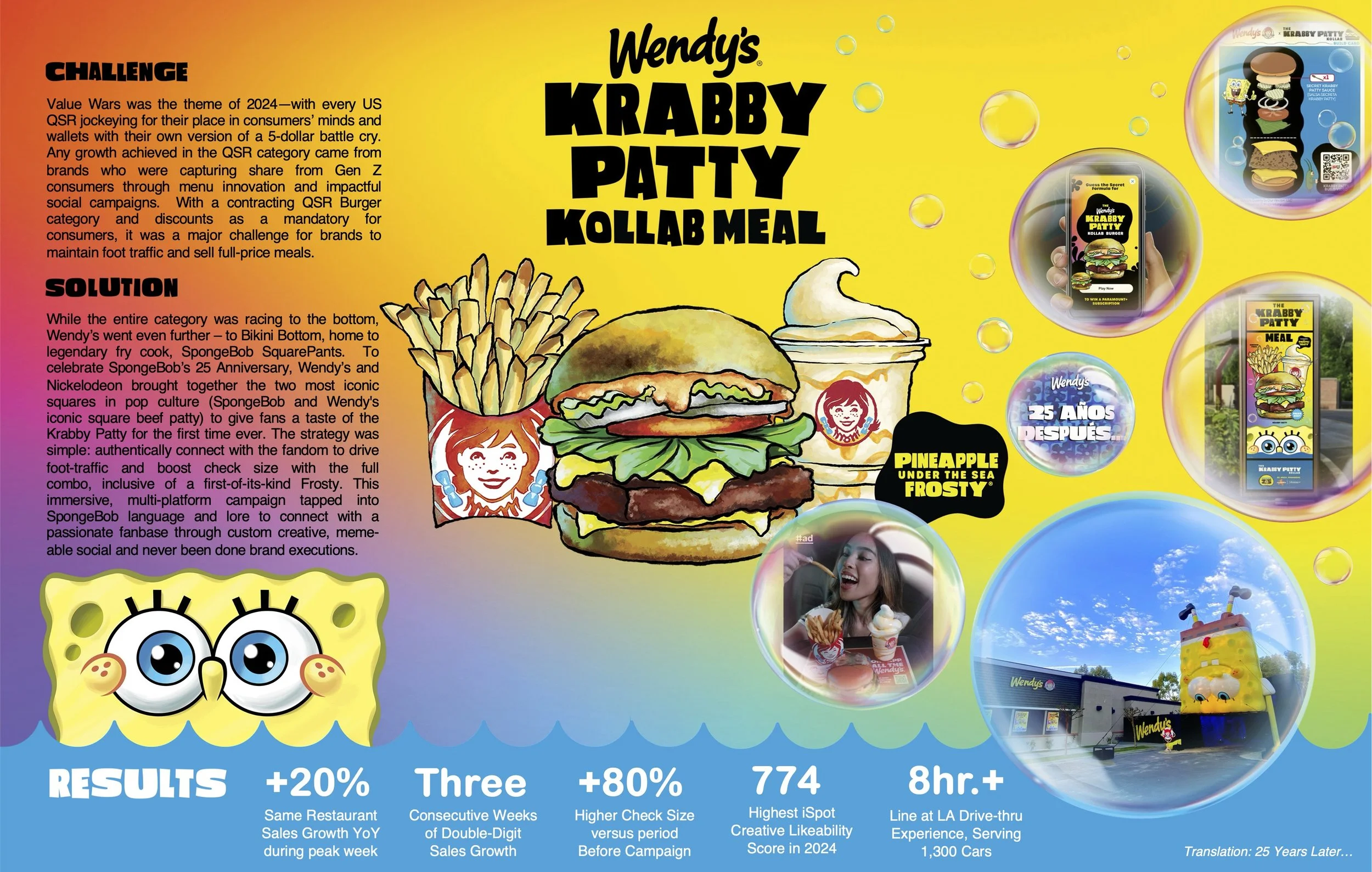
2024 was the year of the Value Wars, with every QSR in America racing to the bottom with their own version of a $5 meal, fighting for Gen Z attention while the burger category quietly contracted. Growth was only possible by stealing share, and discounts had become table stakes. The brief to us was simple and completely unreasonable: don't discount. Win anyway.
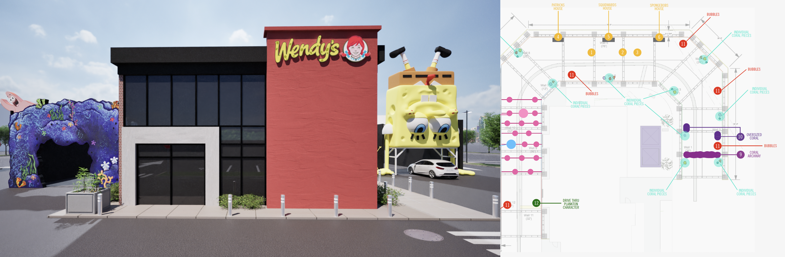
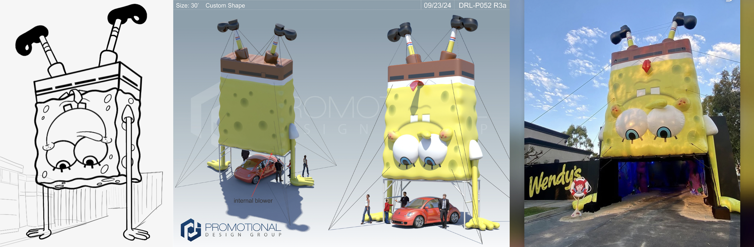
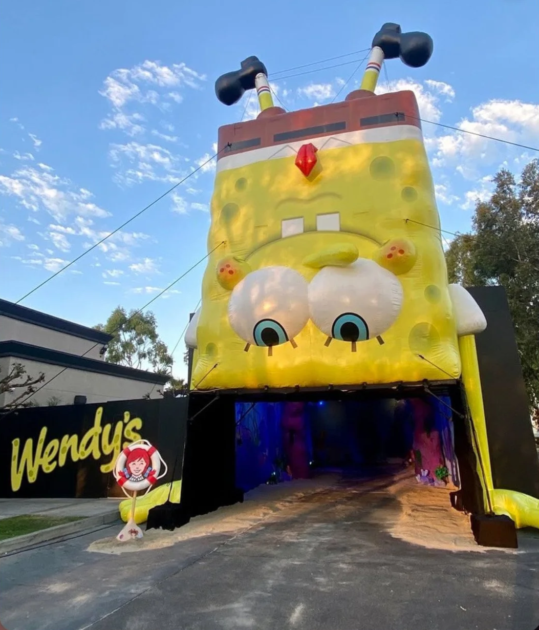
Wendy's answer? Go to Bikini Bottom. To celebrate SpongeBob SquarePants' 25th anniversary, Wendy's and Nickelodeon united two of the most iconic squares in pop culture (SpongeBob's square shape and Wendy's square beef patty) to give fans their first-ever real-world taste of the legendary Krabby Patty, served alongside a Pineapple Under the Sea Frosty. While everyone else raced to the bottom on price, Wendy's went deeper. Way, way deeper.
MY ROLE
CD/AD hybrid, pulling double duty across two teams simultaneously. I contributed to concept direction, handled client presentations, and produced final art, doing whatever was needed to make sure the work held up at every level, from the brief room to the build.
THE SOLUTION
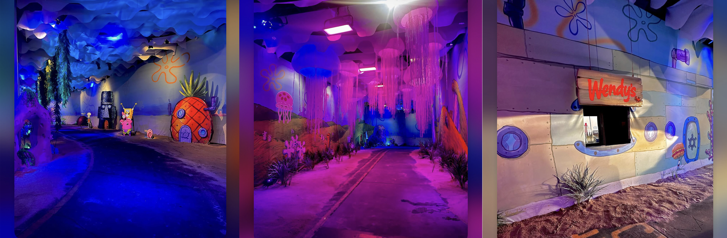
Just like our Wednesday activation, we transformed a real Wendy's drive-thru into a full underwater tunnel through Bikini Bottom itself. Guests drove through the ocean floor, surrounded by coral, kelp, and SpongeBob and Patrick greeting them from above, before receiving the Krabby Patty Kollab Meal on the other side. The campaign extended across custom social creative, meme-native content, and executions built fluently in SpongeBob language and lore, connecting authentically with one of the most passionate fandoms on the internet rather than just slapping a logo on an IP deal.
THE RESULT
The line at the LA drive-thru experience stretched to 8+ hours, serving 1,300 cars. Same restaurant sales grew +20% YoY during peak week. The brand posted three consecutive weeks of double-digit sales growth. Check size jumped +80% versus the period before the campaign launched. The spot earned a 774 iSpot Creative Likeability Score — the highest in the QSR category in all of 2024. And the campaign earned a Cannes Lions submission, recognized as one of the most culturally resonant brand partnership executions of the year.
While everyone else raced to the bottom, Wendy's went to Bikini Bottom…and won.
Agency: TMA | ECD: Laragh Gallagher | CD (Art Direction): Katie Morris / Charles McBride | CD (Copywriting): Courtney Krise | Jr. AD: Emily Baker | Build Partners: Pinnacle / Promotional Design Group
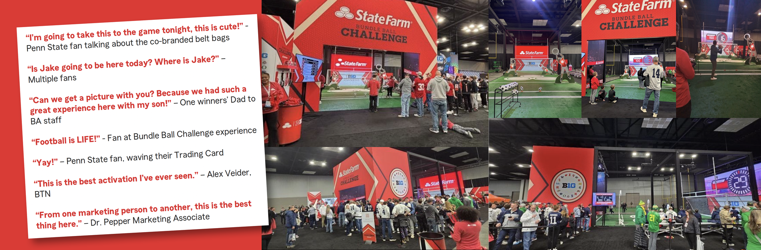
"Football is LIFE!" — an actual fan, completely unprompted
THE ASK
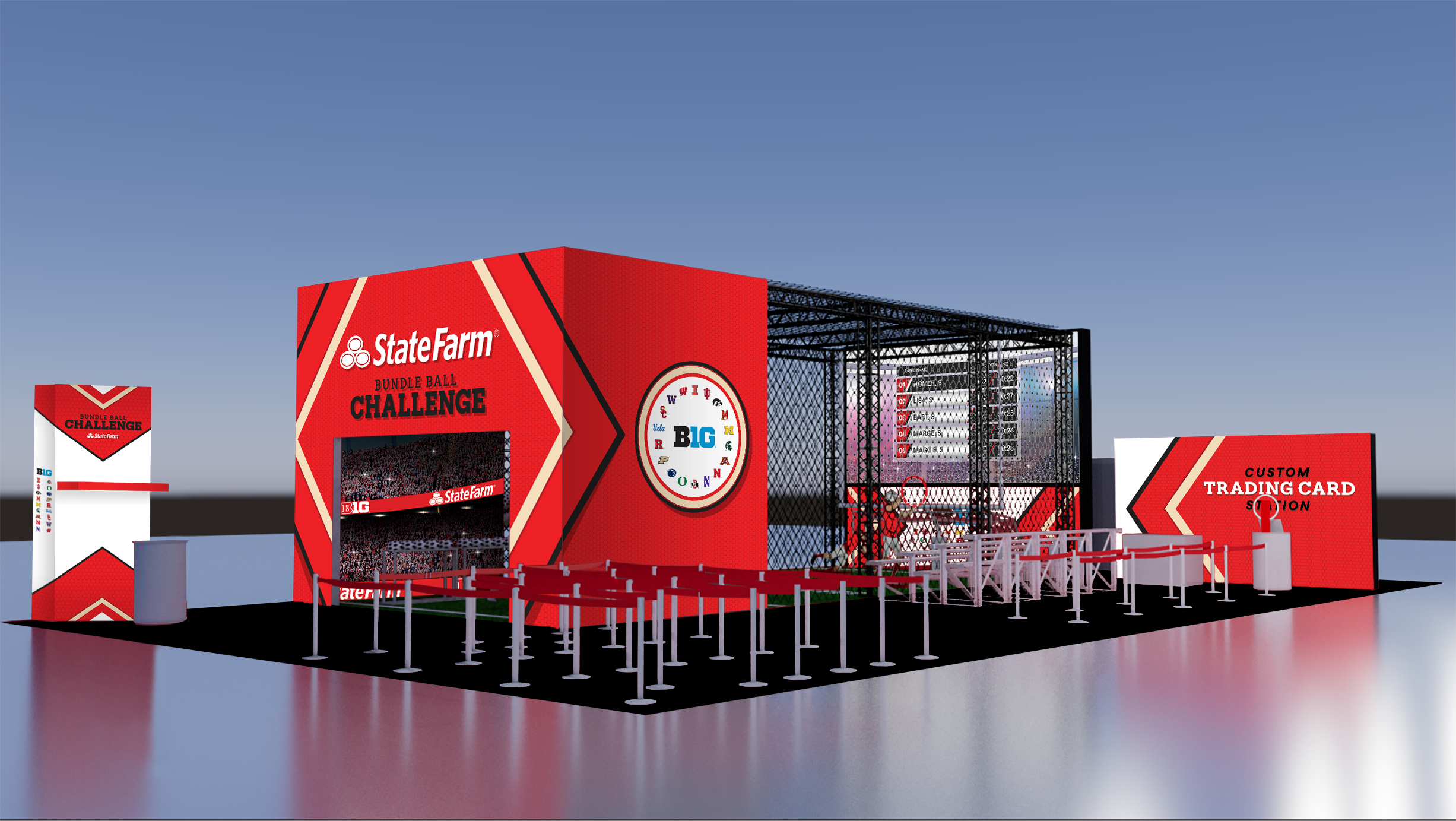
State Farm has been a Big Ten Football Championship sponsor for years. The problem? Their Fan Fest presence had become forgettable. So forgettable, in fact, that the client was questioning whether to show up at all. The brief became something more interesting than a brief: convince everyone, client, agency, and 19,500 fans, that State Farm could actually own the room.
MY ROLE
I came in as a guest Creative Director on an established brand team that needed a shot of experiential confidence. The client was skeptical. The agency was under pressure. My job was to earn the room — fast — by bringing real expertise in consumer journey design, live execution, and the narrative clarity that turns a good idea into an airtight experience. I reshaped the concept, tightened the visual direction, and attended the build in a walking boot with a gnarly ankle sprain, because nothing about this activation was going sideways on my watch.
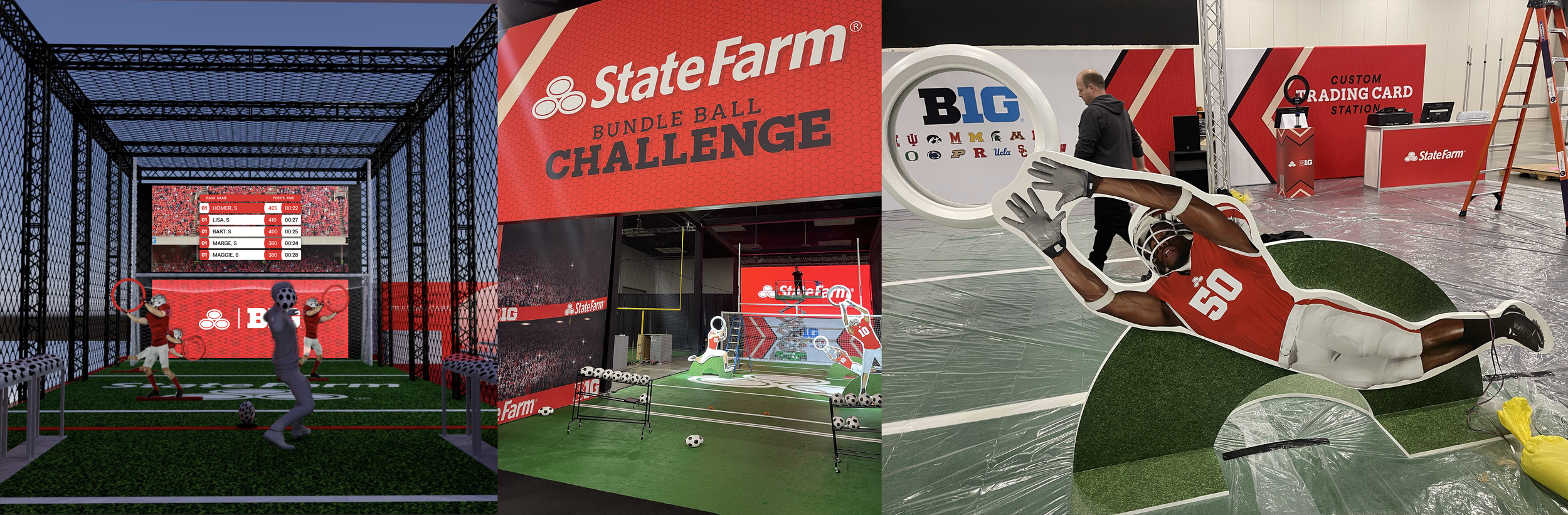
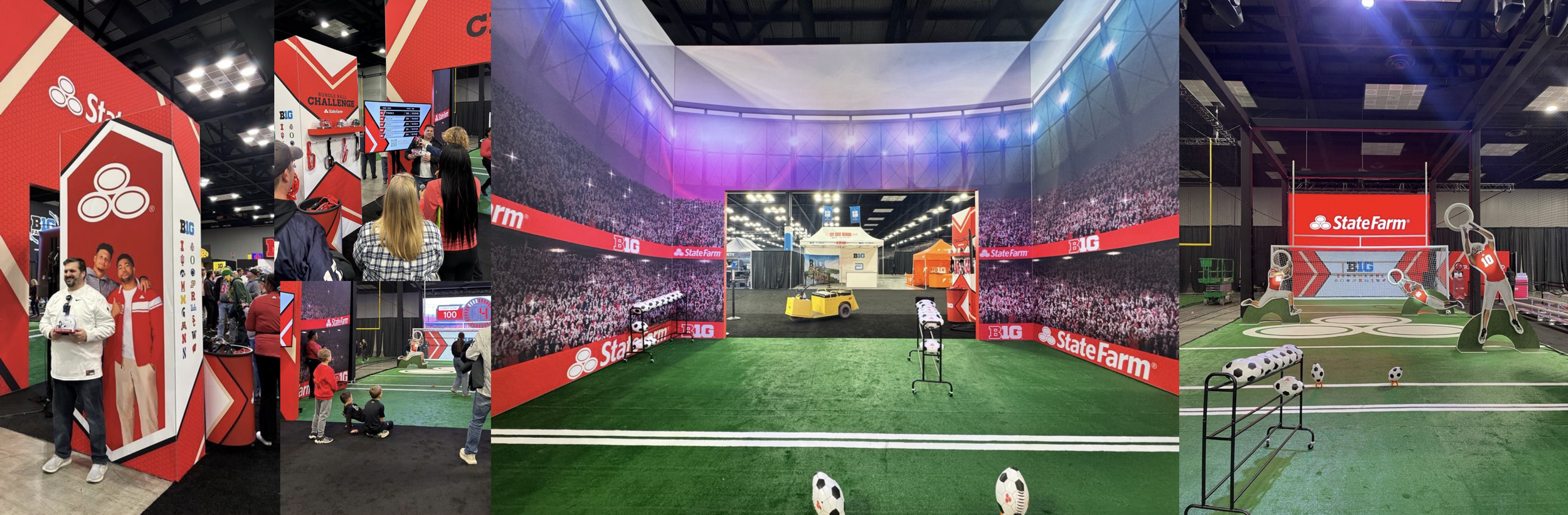
THE SOLUTION
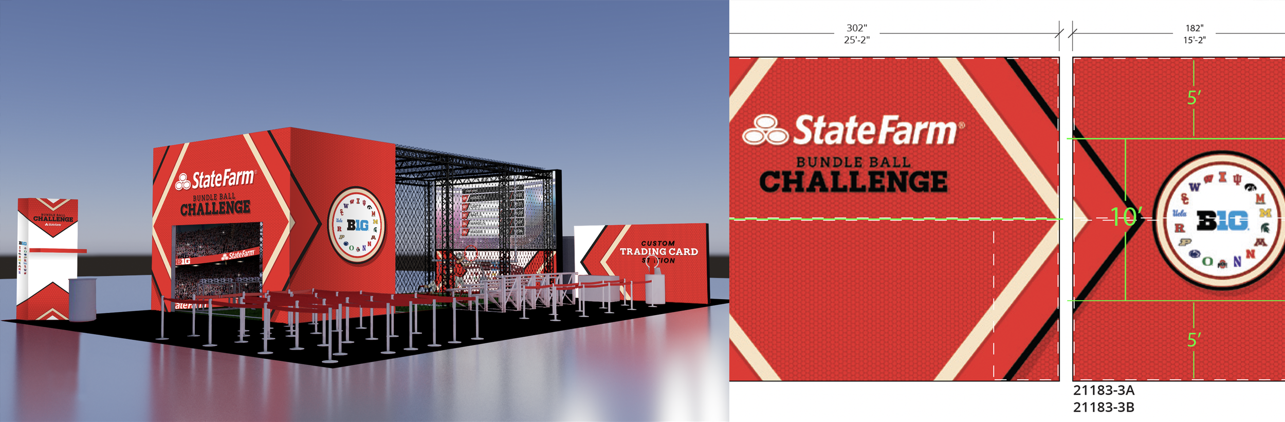
We built the State Farm Bundle Ball Challenge: a gamified, 78'×40' immersive sports experience rooted in the brand's "Bundle is Life" football campaign. The concept brought football and fútbol together into one original game: fans had 30 seconds to throw Bundle Balls (soccer-printed footballs) through player targets, then kick two through a combined soccer goal and field post. Highest scorer each hour won a signed mini-helmet: Mahomes, Coach Lanning, or Coach Franklin. Twelve of fifteen winners went full Mahomes. Make of that what you will.
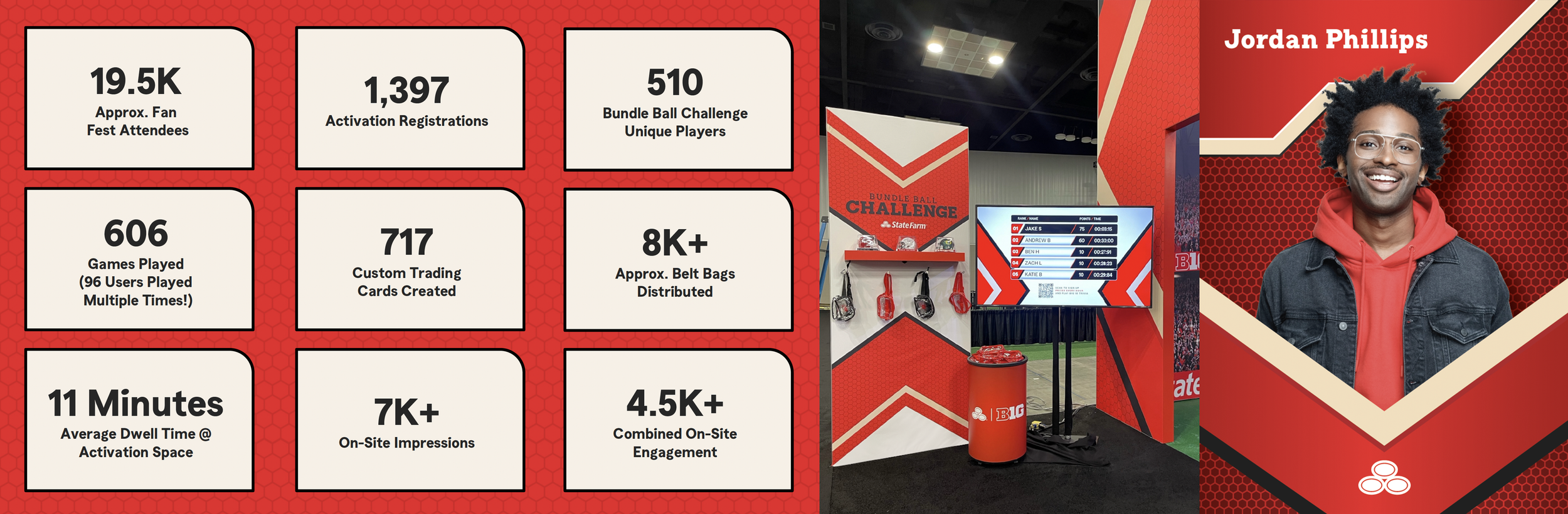
The footprint delivered beyond the gameplay: stadium LED walls with crowd ambiance, live leaderboards, a custom Trading Card Station, 8K+ co-branded clear belt bags, and a BTN live segment that put the activation in front of 35K+ national viewers.
THE RESULT
The activation drew 1,397 registrations and 4,500+ on-site engagements across a weekend that peaked at nearly 20K Fan Fest attendees. Fans averaged 11 minutes of dwell time, not bad for a convention center floor. Ninety-six people liked it enough to play multiple times. A BTN anchor called it the best activation he'd ever seen at Fan Fest. A Dr. Pepper marketing associate pulled a "from one marketing person to another" and agreed. The concept and visual comps alone were strong enough to get the client to triple their original budget before a single ball was thrown, and the execution delivered on every dollar. Walking boot and all, totally worth it.
Agency: TMA | ECD: Rick Utzinger / Laragh Gallagher | VP CD: Whitney Hill | CD: Katie Morris | ACD: Claire Randall / Emily Herron | Sr. AD: Brian Luneckas | Build Partner: Next/Now
Some projects you take because you have to.
THE ASK
This was a pro-bono spot for Mothers Against Drunk Driving, and the reason we said yes should be self-evident. The mission was to make the reality of drunk driving impossible to sit with comfortably, to take statistics that people have learned to scroll past and make them land with the weight they deserve. The kind of work that reminds you why this job matters.
MY ROLE
I served as Creative Director and art director, co-conceptor alongside the ridiculously talented JD Sutherland, and sell-in and presentation lead to both the MADD team and to Philip's family directly. Earning that family's trust, walking them through the creative, explaining every choice, getting their blessing to tell his story, was some of the most meaningful and humbling client work I have ever done. They were deeply touched by how we brought it all to life, and that will stay with me for a long time.
THE SOLUTION
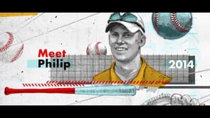
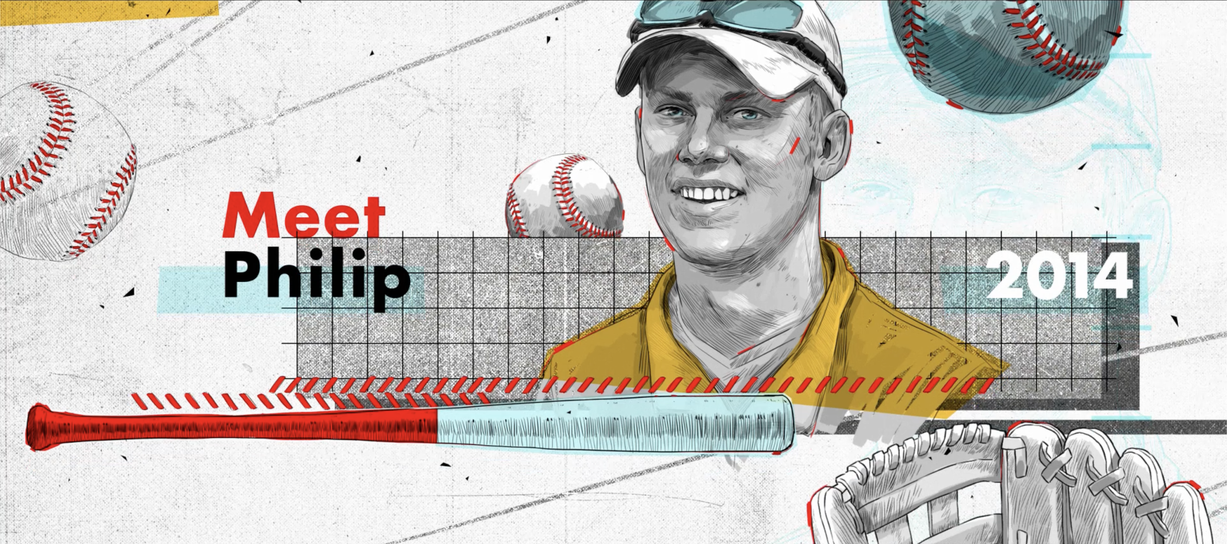
Meet Philip. In 2024, Philip's car was hit by a drunk driver. He survived, but with a traumatic brain injury that changed everything. His story opens the spot, rendered in a striking illustrated animation style that feels urgent and kinetic without ever feeling exploitative. Bold, intentional, and built with enormous care for the person at the center of it.
From there the spot becomes a full data reckoning. The statistics around drunk driving cascade across the screen in a way that makes the numbers visceral rather than abstract: the volume of impaired drivers on the road every single day, the arrests, the injuries, the staggering financial and human cost. The title says it all. Stick to the Stats. Because the stats are damning enough on their own.
THE RESULT
Philip's family were incredibly touched by the telling of his story and the way the team brought the entire piece to life. There is no metric for that. It is, without question, one of the most rewarding things I have ever put my name on.
Agency: TMA | ECD: Ben Day | Art Direction: Katie Morris | Copywriting: JD Sutherland | Production Partner: ATK PLN
Two things. One card. Zero reasons not to download.
THE ASK
BetRivers Casino needed to launch their One Card program: a rewards bridge between their brick-and-mortar casino and the BetRivers app that hands new users free betting money just for linking the two. The goal was to make a genuinely useful but not exactly thrilling loyalty mechanic feel effortless, fun, and worth downloading for.
MY ROLE
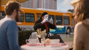
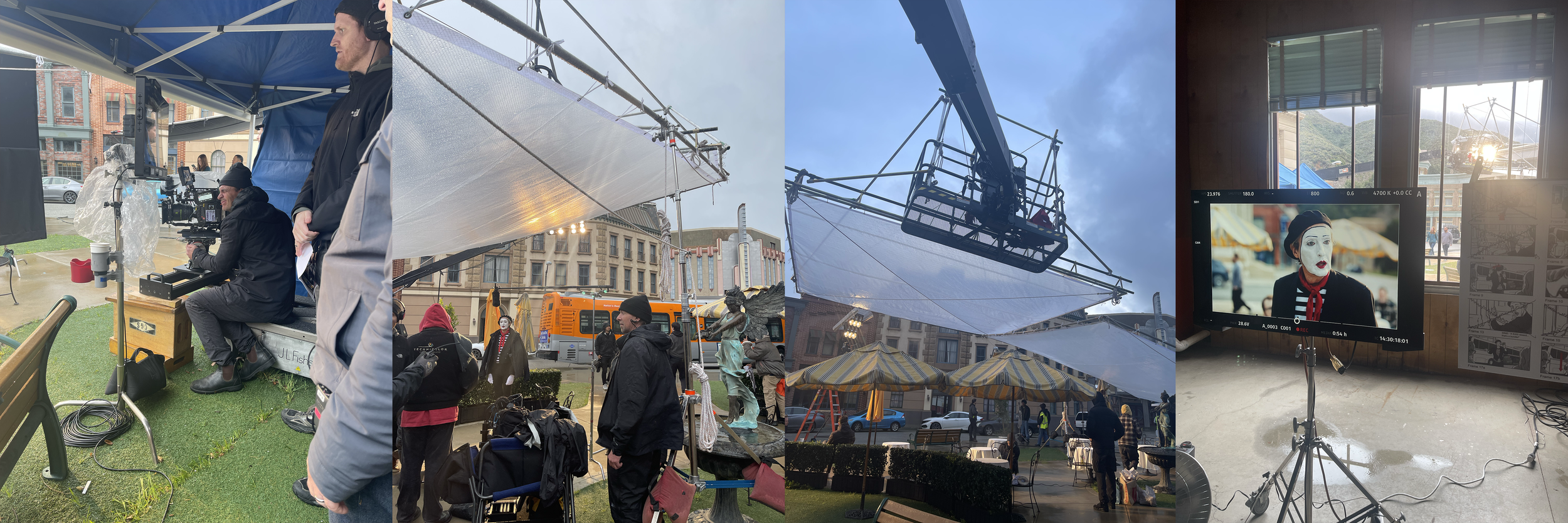
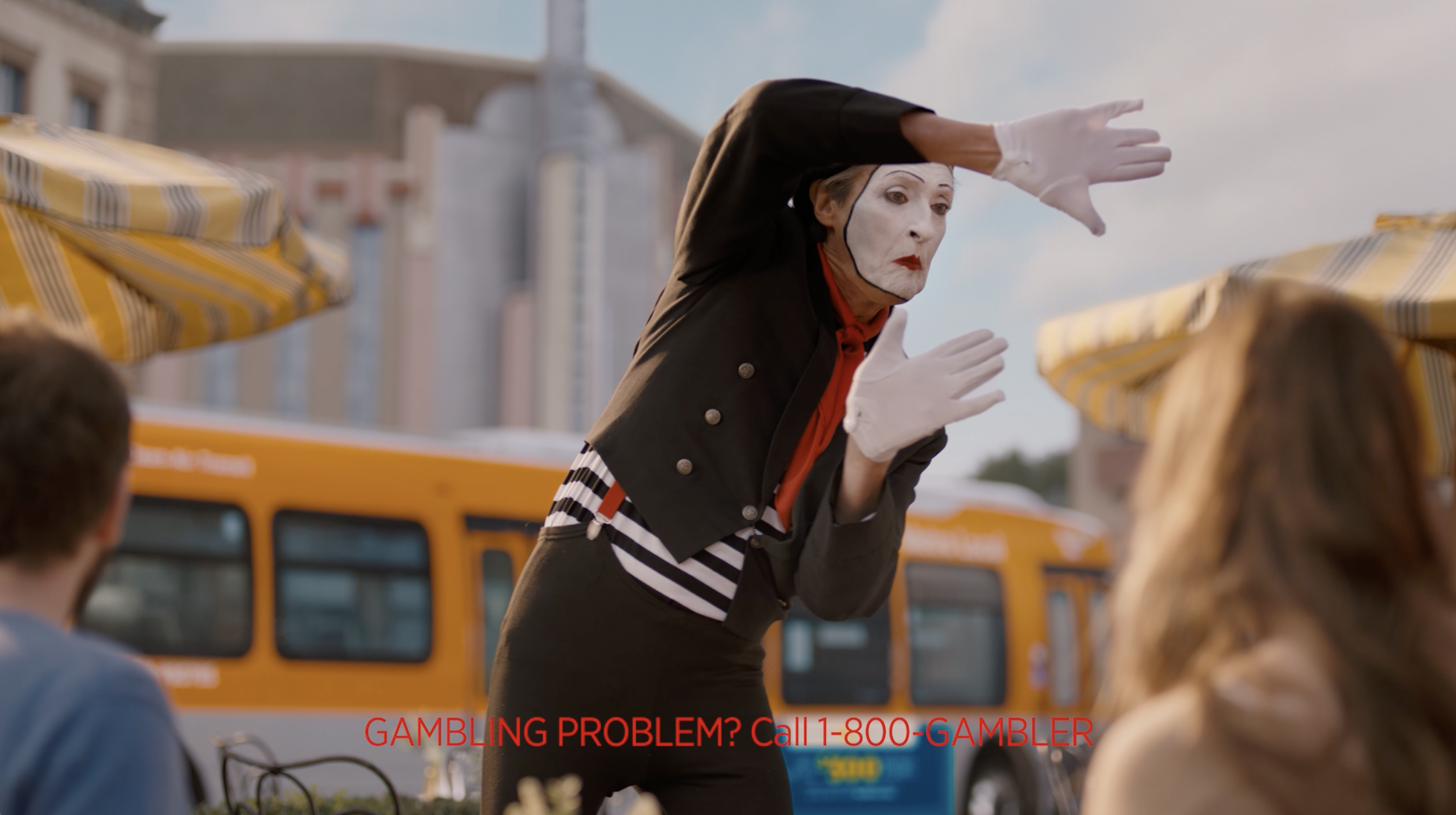
Creative Director and art director on the spot, from concept through final production. This was a full shoot experience that taught me more about the craft of broadcast production than I could have anticipated going in. Including, but not limited to, what it is like to spend multiple days on set with a mime. A experience I was not prepared for and will never fully recover from.
THE SOLUTION
The creative idea was simple and a little absurd: what better way to show how seamlessly two things come together than a mime? The spot follows a mime silently and expressively demonstrating the ease of the One Card program to a completely oblivious couple enjoying a sunny sidewalk café — who discover the offer on their phones and light up. Warm, cheeky, and visually clean from start to finish.
What you don't see on screen is that we were in a torrential downpour for every single minute of filming. Every bit of that sunny warmth was hard-earned, and the production team deserves enormous credit for pulling it off without a trace of rain in the final cut.
THE RESULT
The clients loved it. The spot performed well enough to inspire what became a long-running broadcast relationship between BetRivers and the agency — which, in the world of advertising, is about as strong a vote of confidence as a client can give.
Agency: TMA | ECD: Craig Miller | CD (Art Direction): Katie Morris | Production Partner: Natural Selection
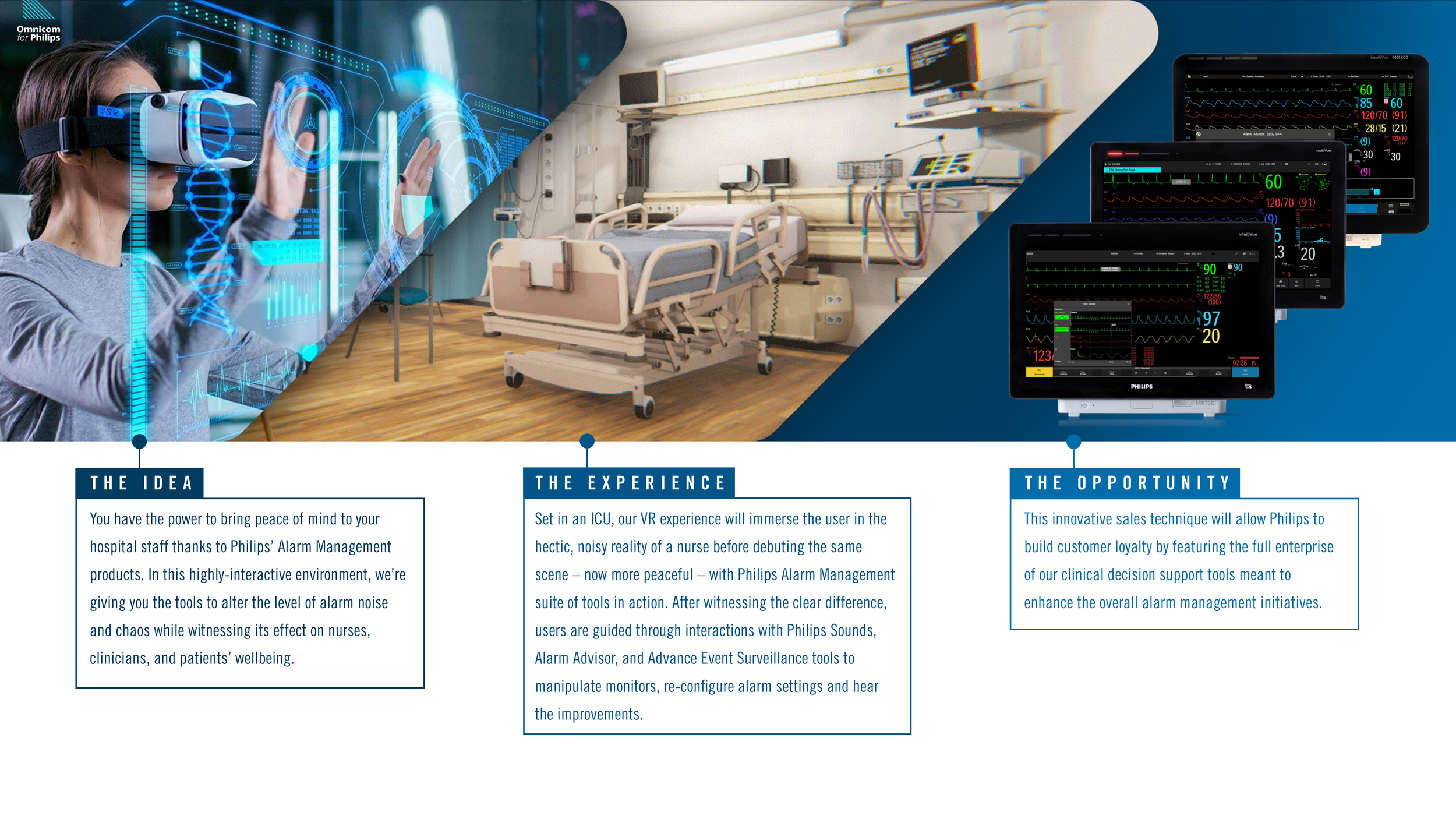
What if you could feel the problem before you solved it?
THE ASK
Workforce shortages are the number one challenge reported by healthcare organizations right now, and registered nurses are at the epicenter. Higher patient-to-nurse ratios, hundreds of alarms per patient per hour, and the lingering psychological weight of a pandemic that asked everything of our frontline workers have created a crisis that's hard to quantify on a slide deck. Philips' Alarm Management solutions exist to meaningfully address the environmental chaos nurses and clinicians face daily, but getting a product demo in front of hospital decision-makers at scale is complicated, costly, and easy to tune out.
The ask: build a sales tool that couldn't be ignored. Something that made buyers feel the problem before presenting the solution.
MY ROLE
Creative Director and enthusiastic first-time VR builder. This was my first foray into virtual reality as a medium, which meant learning the technology, understanding its constraints and possibilities, and translating that into a coherent creative approach, all simultaneously. I spent weeks immersing myself in VR gaming specifically to understand what the tech could do and how users move through virtual space, then brought that knowledge back to the team to inform an approach to a B2B healthcare context that had never been tackled this way before. Building the plane while flying it, as they say. (The plane landed.)
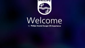
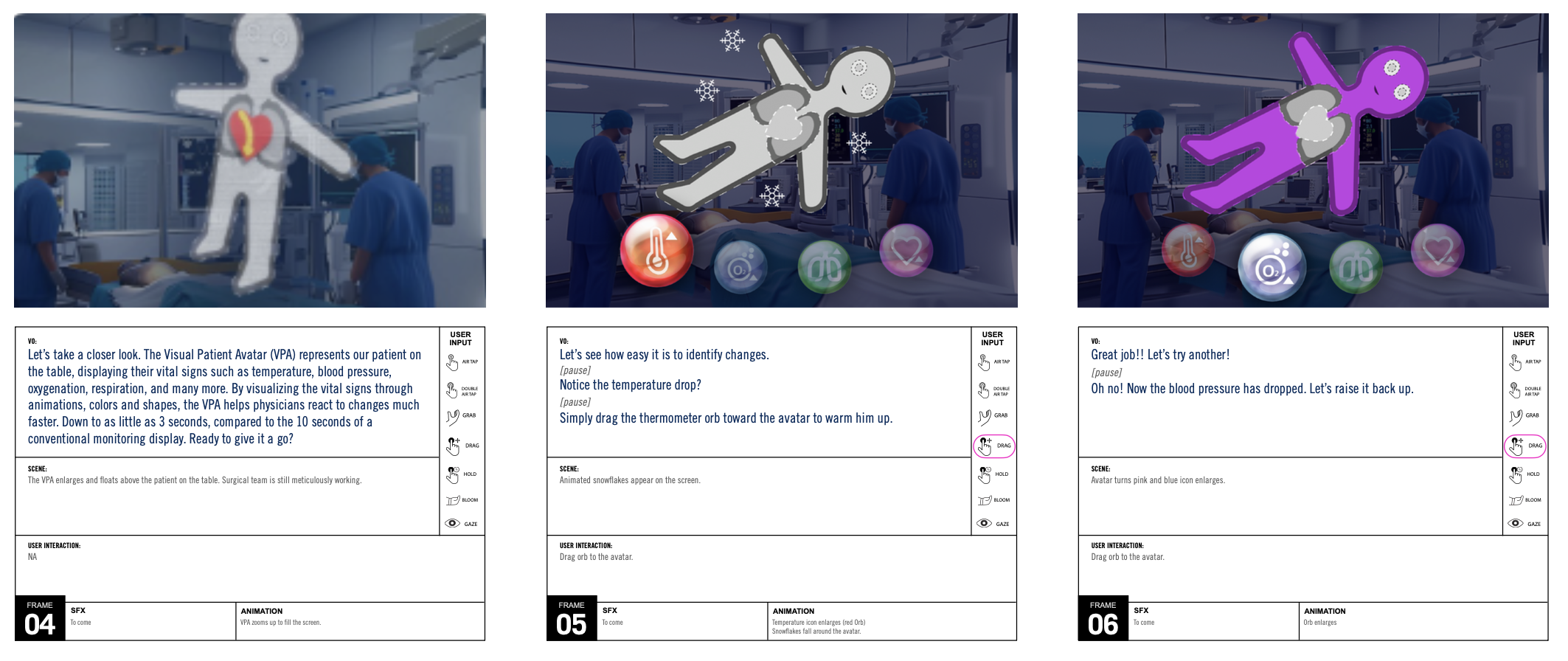
THE SOLUTION
The Philips Sound Escape VR Experience drops users directly into a fully rendered hospital, beginning outside the building and moving them through the open ecosystem of connected Philips tools before entering the ICU floor itself. There, the user inhabits the perspective of a nurse navigating a chaotic, alarm-saturated environment: competing sounds, flashing monitors, constant interruptions. The experience makes the stress visceral in a way no PowerPoint ever could.
Then the scene resets, now with Philips Alarm Management active. Users interact directly with Philips Sounds, Alarm Advisor, and Advanced Event Surveillance tools: manipulating monitors, reconfiguring alarm settings, and literally hearing the difference the technology makes. The before-and-after is experiential, not theoretical, which is exactly the point. The goal was to hook on a human level, create genuine product desire, and leave a lasting impression that drives hospital staff to request real demos.
THE RESULT
The clients loved it, so much so that they immediately came back to expand the concept, commissioning VR experiences for all of their alarm management tools as the next phase. As far as results go, a client who doubles down is about as clear a signal as you can get. And personally, getting to do anything that eases even a fraction of the burden on the nurses and clinicians who show up every single day to help people — that one means something.
Agency: TMA | ECD: Laragh Gallagher | CD (Art Direction): Katie Morris | CD (Copywriting): Mary Adams Bode | Development Partner: Northdocks
Where every girl gets to cross the finish line first.
THE ASK
NASCAR is one of the most beloved sports institutions in America, and one of the most historically male-dominated. As the sport has actively worked to broaden its audience with women and girls, the timing was perfect for Justice — the girls' apparel brand sold exclusively through Walmart — to launch their new NASCAR collaboration at Daytona. The ask: design an activation that showcased the collection, introduced Justice to an entirely new audience, and felt like an undeniable celebration of girl power in an overwhelmingly masculine environment.
A glittery, pink, checkered-flag fever dream in the middle of Daytona? Say less.
MY ROLE
Creative Director from concept through execution, responsible for the full narrative, look and feel, multiple rounds of client presentations, and every sparkly detail in between. This was my glittery girly baby and I treated it accordingly.
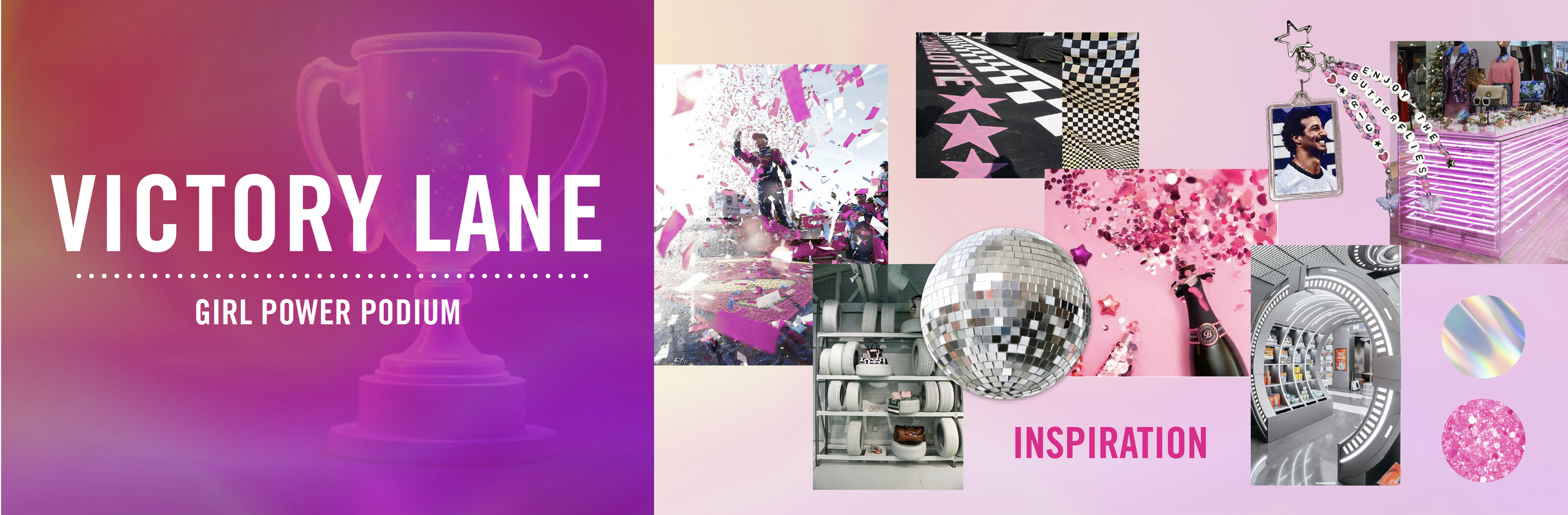
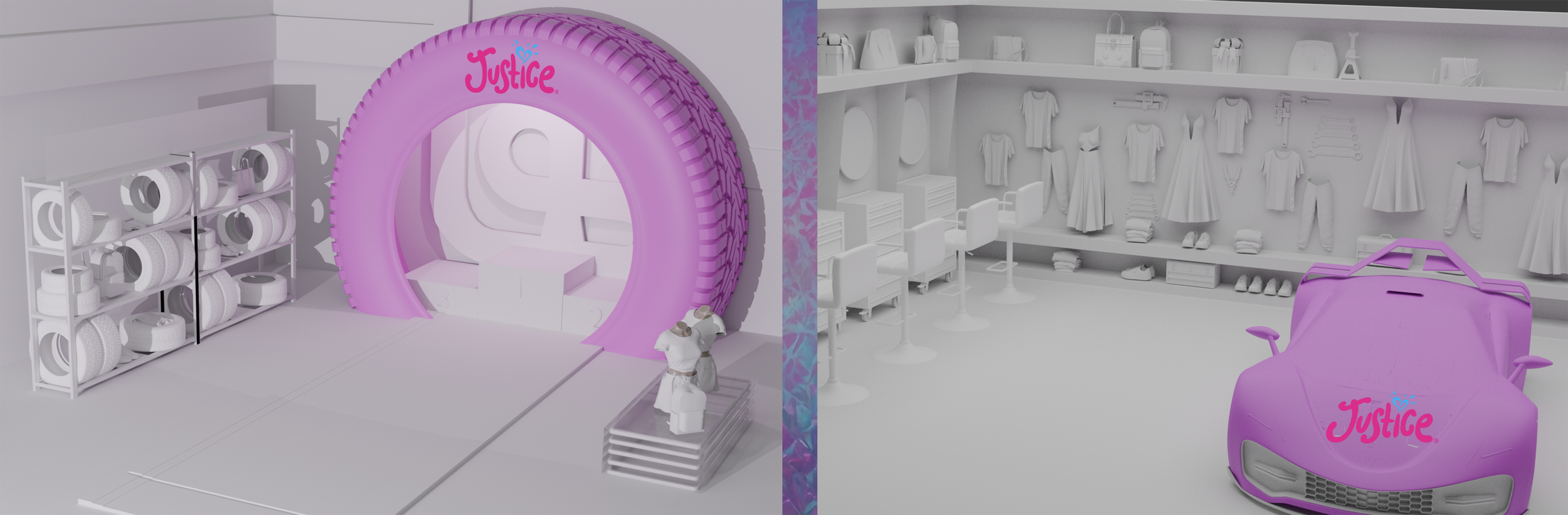
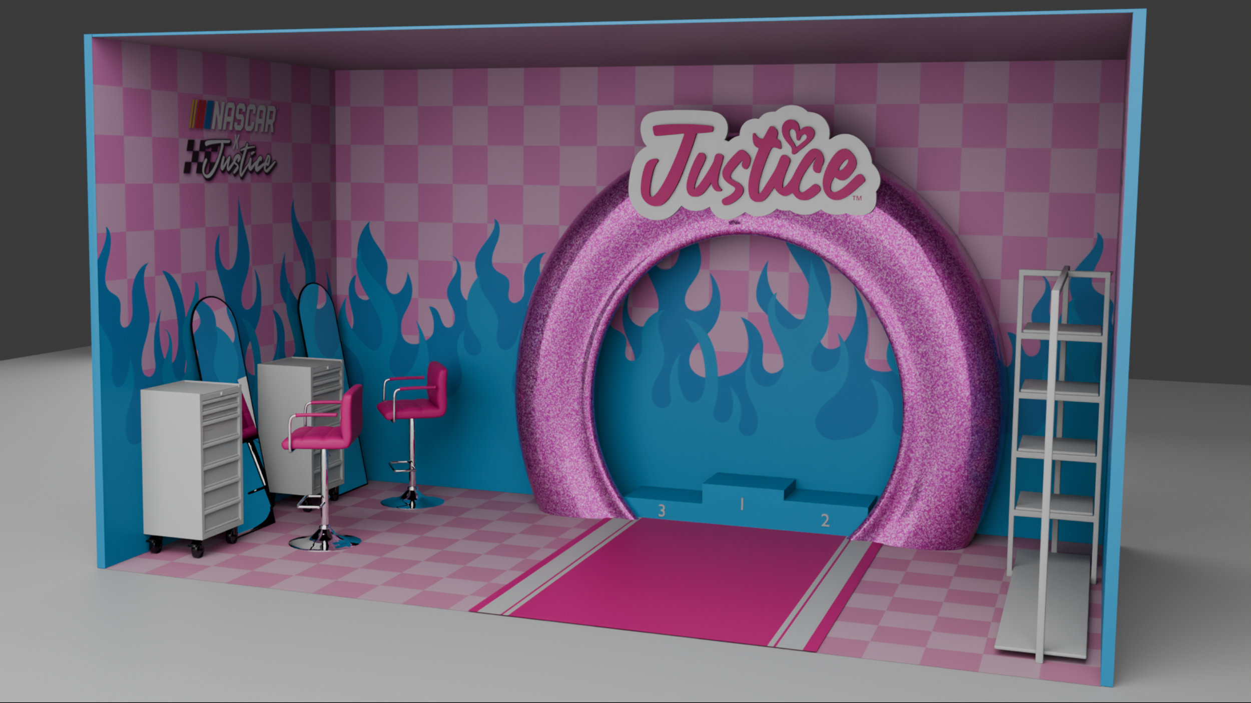
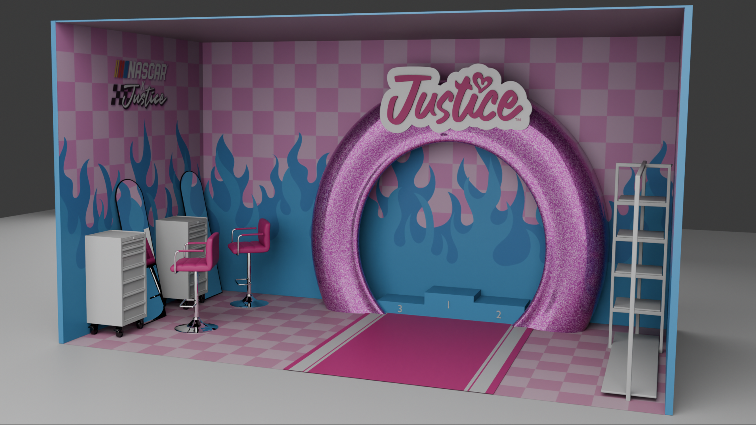
THE SOLUTION
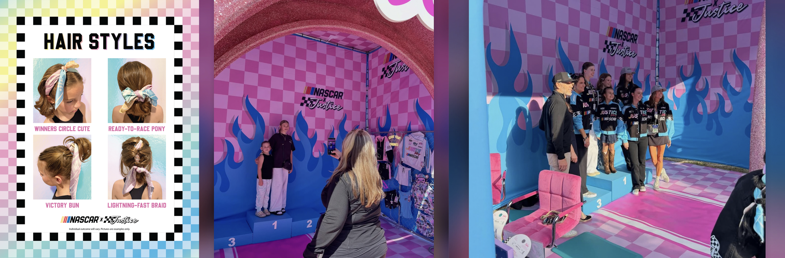
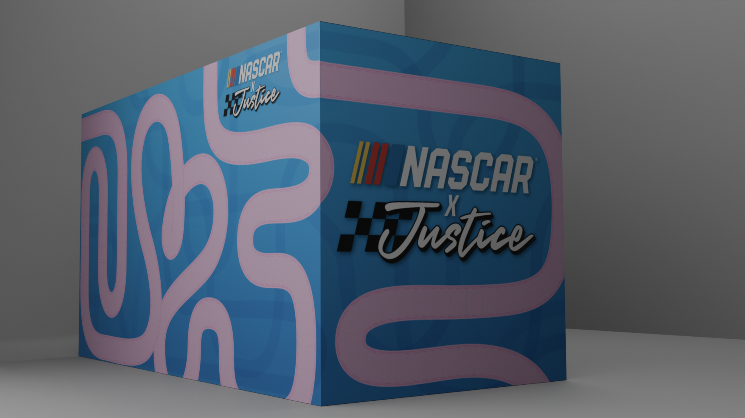
We built Victory Lane — a self-contained experiential world that took everything NASCAR and turned the volume all the way up in hot pink and baby blue. Guests entered through a towering glitter-covered tire arch into a fully immersive space wrapped in checkered walls, bold blue flame graphics, and LED display shelves showcasing the entire Justice × NASCAR collection.
Inside, girls got the full race-day glam treatment at a pink salon hair styling station offering four signature looks, then stepped up to a winner's podium center stage to pose for a commemorative photo and pop a glitter or confetti "champagne" popper just like the pros. The exterior was equally bold: a co-branded cube wrapped in the NASCAR × Justice identity that announced itself loudly from across the floor and pulled in a crowd that might never have sought out a Justice activation on their own.
THE RESULT
The activation did exactly what it was designed to do: brought an entirely new, younger, more diverse audience into the NASCAR ecosystem while giving Justice a cultural moment that extended far beyond a product launch. Every girl who stepped onto that podium left feeling like a champion — which, at the end of the day, was the whole point.
Agency: TMA | ECD: Laragh Gallagher | CD (Art Direction): Katie Morris | CD (Copywriting): Courtney Krise | Build Partner: JCDP
'Tis the Season for Safety.
THE ASK
OnStar has a product that genuinely saves people: roadside assistance, turn-by-turn navigation, crash response, stolen vehicle help. But in a market crowded with competing services, getting existing GM owners to actually activate and engage with their plan is easier said than done. The ask: make OnStar's rewards program feel relevant, fun, and impossible to ignore during the holiday season, when more people are on the road and the roads are at their most hazardous than any other time of year.
MY ROLE
Creative Director and one of the more gleeful illustration collaborators I've gotten to be. I drove the concept, overall narrative approach, and look and feel, then used AI to help inform and establish a base for the illustrated characters and world before my own hands and those of an insanely talented team brought it all to life. I also built the scalability into the idea from the jump, intentionally. More on that in a second.
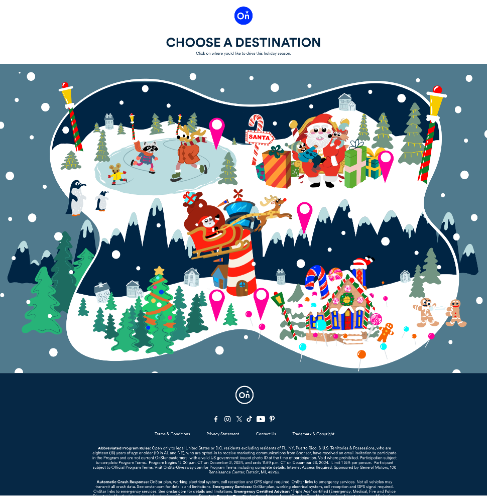
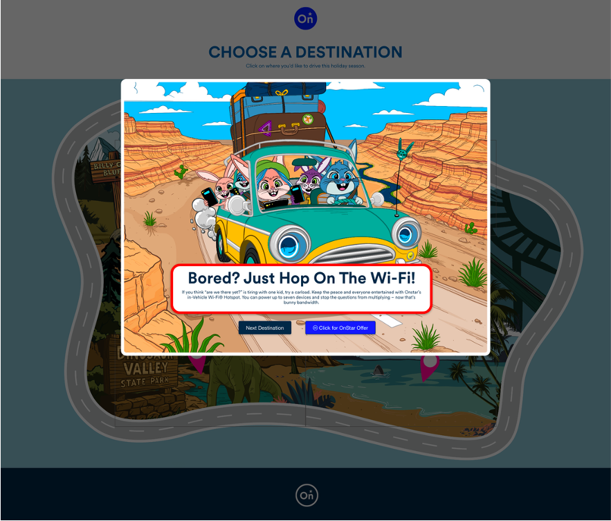
THE SOLUTION
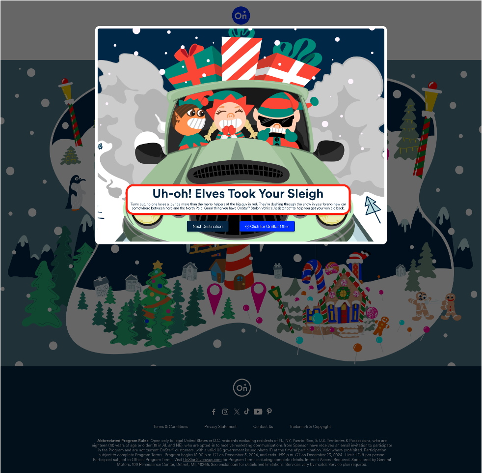
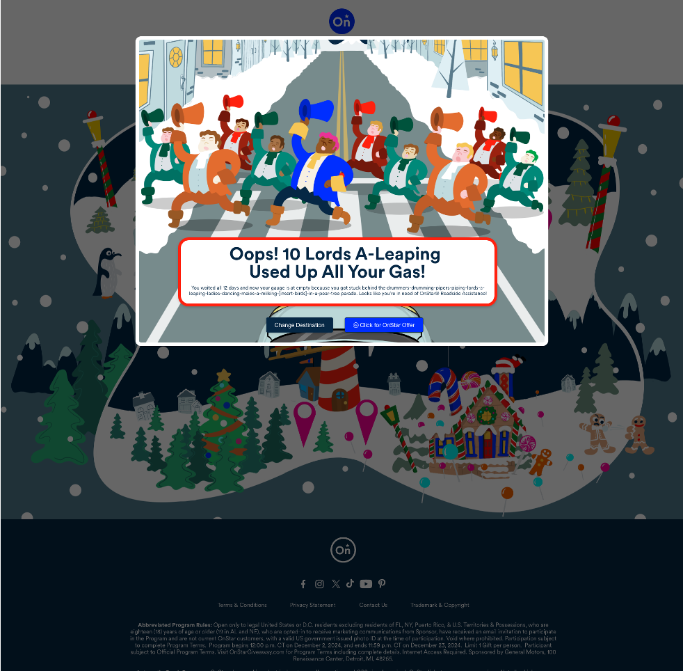
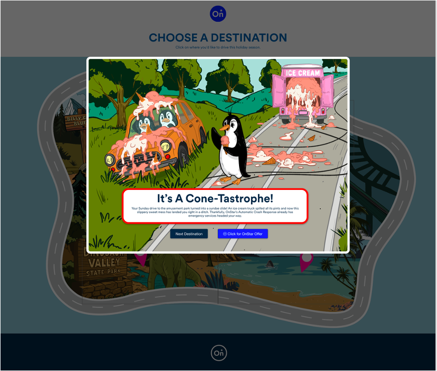
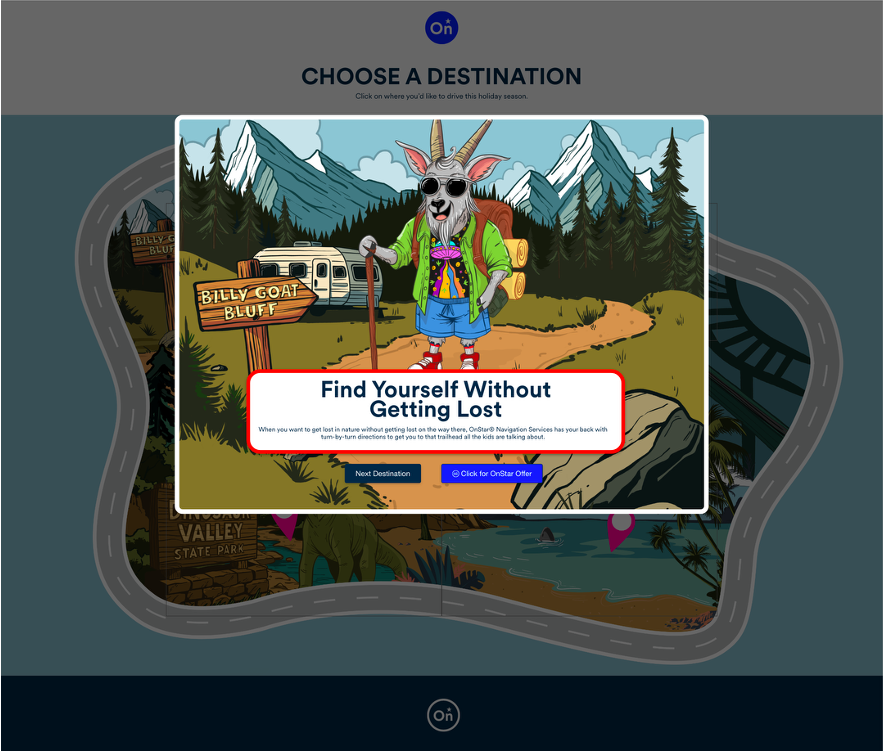
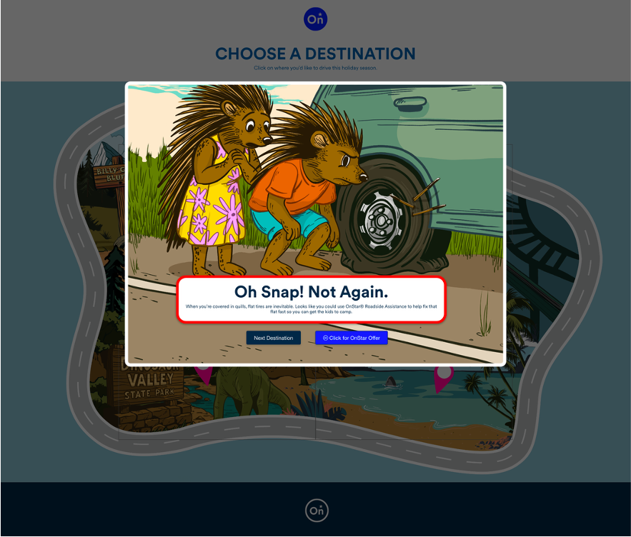
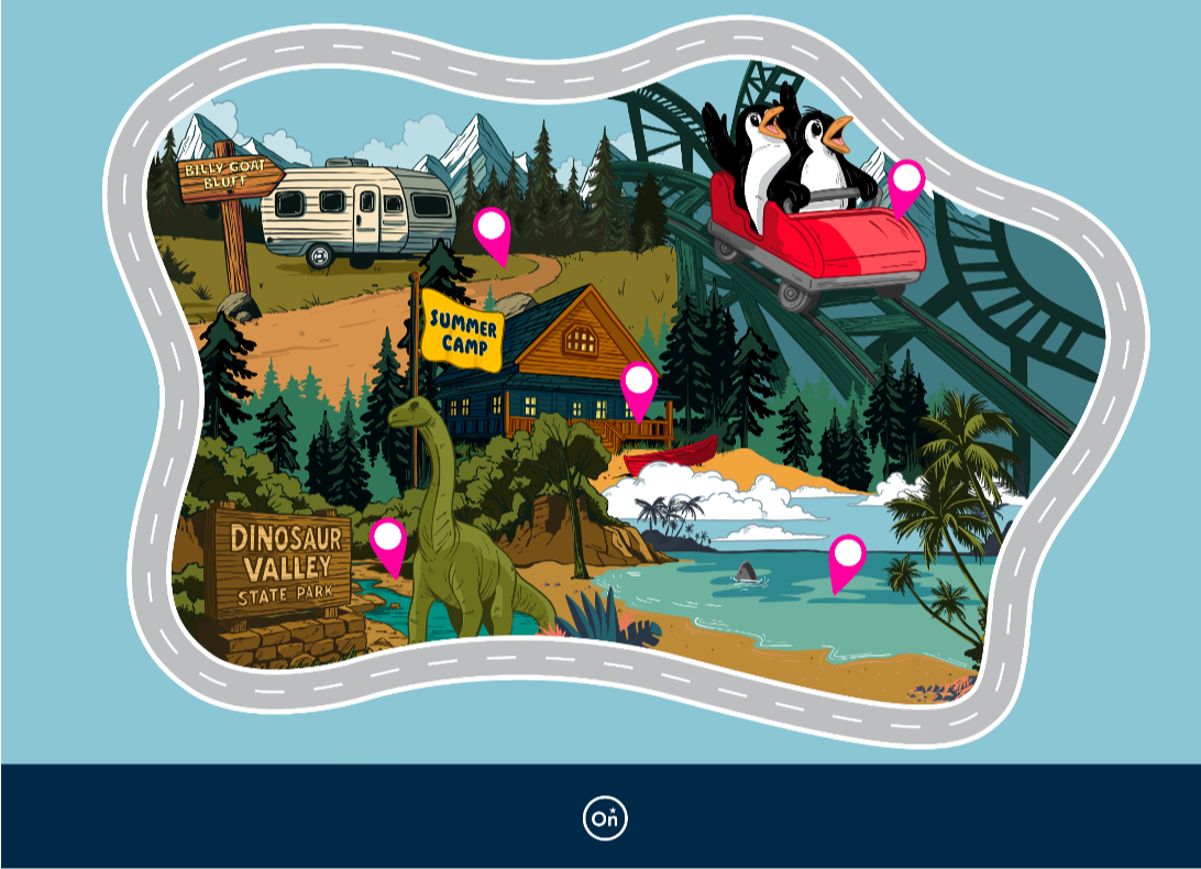
We built an email-to-microsite gamification experience called the OnStar Holiday Giveaway, living at onstargiveaway.com. GM vehicle owners received a holiday email directing them to a richly illustrated, animated winter map packed with five destinations to choose from: an ice skating rink, photos with Santa, the airport, a holiday tree lot, and a gingerbread house.
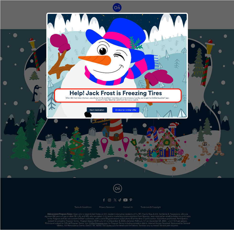
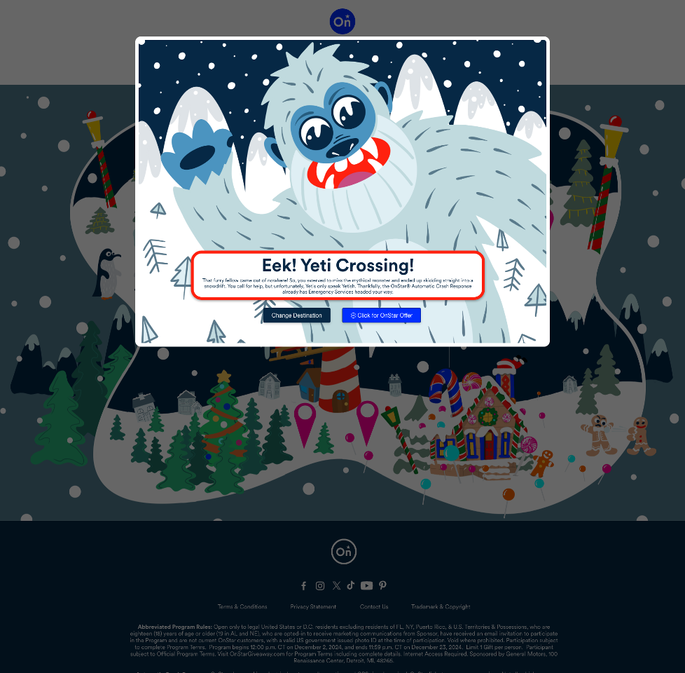
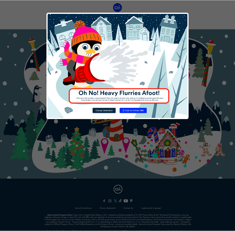
Pick a destination and something wonderfully absurd gets in your way. A Yeti jumps out of nowhere and you swerve into a snowdrift — good thing OnStar Automatic Crash Response already has help on the way. Jack Frost freezes your tires — OnStar Guardian to the rescue. A penguin with a snowblower buries the road — your OnStar Advisor has Turn-By-Turn Navigation covered. The 12 Lords a-Leaping parade drains your gas tank — Roadside Assistance, obviously. Each scenario was crafted to showcase a different OnStar feature in the most unhinged, delightful way possible, so that users were learning real product benefits while actively laughing at a snowman winking at them.
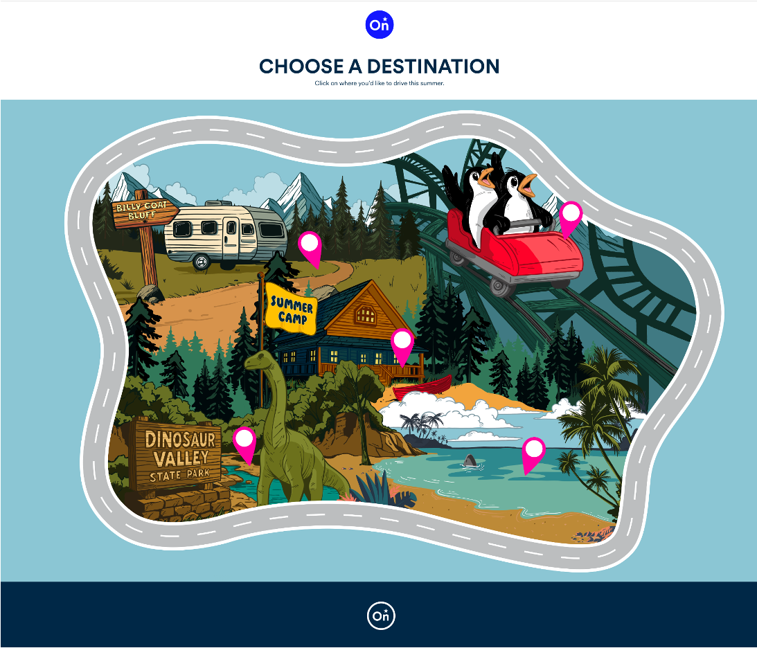
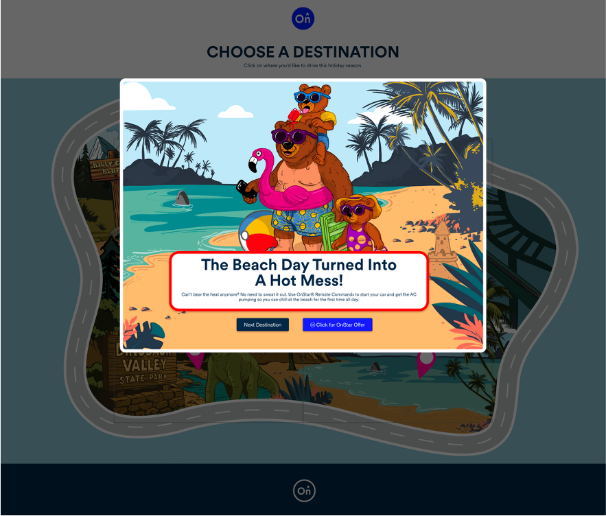
Hit the OnStar button to arrive safely, collect your discounted plan offer, and land on a gift-pile confirmation screen worthy of the North Pole itself. The experience was designed from day one with intentional reusability: peak travel moments happen year-round, and so should this mechanic.
THE RESULT
Year 1 generated 5,625 trial starts and $1.4M in revenue for OnStar. The client came back for Year 2 with an updated summer version: new characters, new destinations, same chassis, proving the concept's scalability exactly as intended. Making something both clients and consumers love enough to want more of it is the job. This one delivered.
Agency: TMA | ECD: Laragh Gallagher | CD (Art Direction): Katie Morris | CD (Copywriting): Mary Adams Bode | Development Partner: TMA Hydra